Narrowing our Focus
Our team first conducted user testing with the current system using ourselves as the user. While this does introduce bias, we only had time for one round of public data collection and design ideation for this project. This initial process allowed us to have a baseline of understanding of the current system for ourselves. It was my role within the team to document our process. At this stage, I kept track of our initial impressions of the website and what we thought the possible problem areas could be. This gave us a jumping-off point for where to focus our future research.
Onto Testing

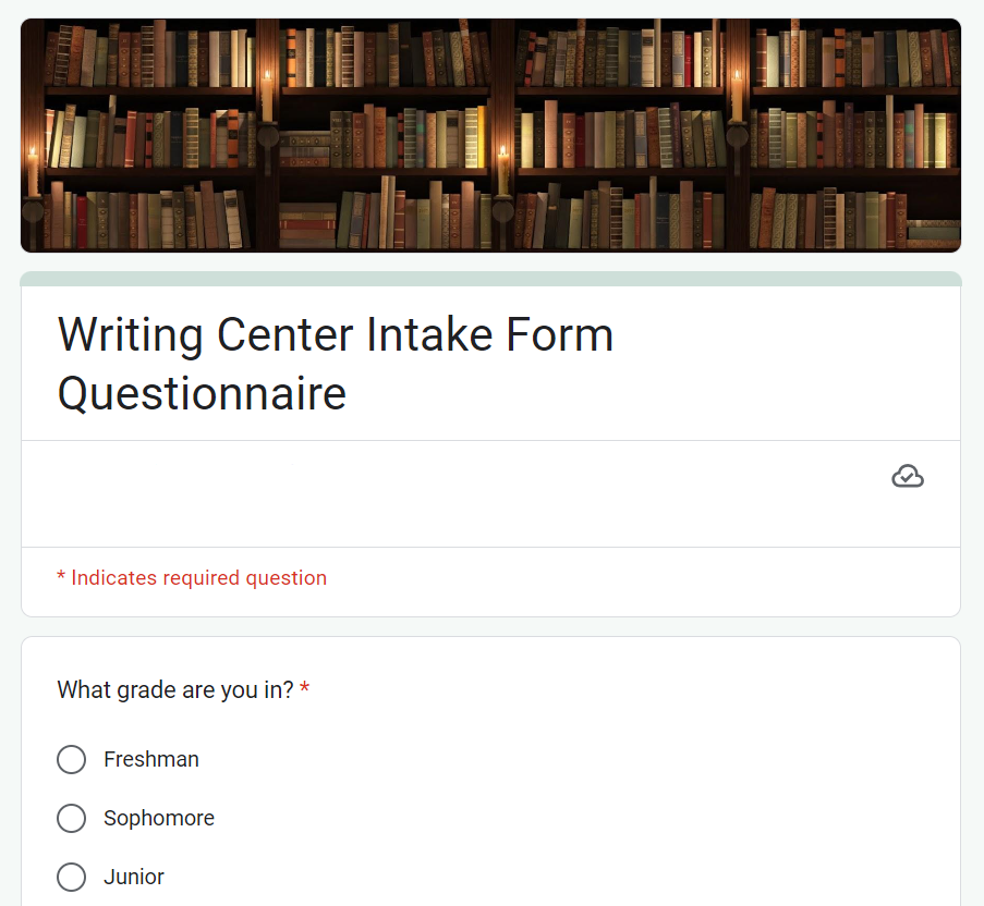
My team and I went into our data gathering hoping to reach as large and diverse a group of people as we could within the given time period. So, we developed an online survey through Google Forms. This made it easy to spread around to people through the use of a simple scan-and-go QR code. We were able to post it around the MSU campus so that we got varying types of users, wanting to avoid heavily biased data.
The survey data gave us an overview of our user demographic and needs. However, my team and I wanted to further our research before moving on to our design ideation. To complement our broad, quantitative data, we decided to conduct user interviews to add on more specific, qualitative data. We had two team members put together a case study on one individual’s experience with the site. Using this testing method, we were able to get descriptive feedback on what problem areas there were and what design choices the user was expecting to see.
Design Ideation
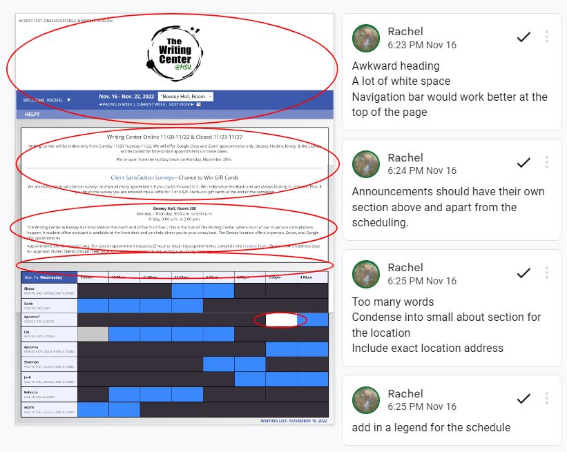
Putting together the data gathered, my team and I saw that most users were struggling to understand and navigate the appointment-scheduling page of the website. We quickly focused our attention on redesigning the scheduling page – the coloring and layout was proven to not be user-friendly for new users. We compiled a list of changes we wanted to make, and I provided our team with a mockup and a prototype design. I ended up creating a clickable prototype in Google Slides that allowed the client to see how the final version would work.
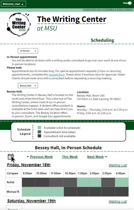
We found that the flow of the site did not match the presumed process in the user’s mind. I wanted to make the scheduling site much simpler. I made its use more straight-forward by having a clear flow guiding them through the process and not throwing too much irrelevant information at them. That is why I have the information organized section-by-section, and it is revealed as users work through selecting their preferences. I also wanted to make a green and white themed site design, unlike the gray and blue theme that felt out-of-place for an MSU site and did not match the Writing Center homepage.
Final Takeaways
Working with Dr. Smith on this project, I gained valuable experience with the process of staying in contact with a client through interviews and process emails, as well as reporting findings. Working in a team also required this constant communication. At times, we were all individually working on separate tasks, so it was imperative that we keep each other updated and keep to a timeline in order for these parts to all come together.
I also gained experience in how to make a clickable prototype that is well-informed by user research. That said, when making the prototype, I had to fill in the gaps in the data with my own assumptions or by falling back on the original design, which is far from ideal. Had I been given more time with this project, I would have taken the prototype to users to do more testing. This could inform a better redesign, and I could repeat this cycle of testing and redesign until the testing comes up with minimal negative results.
This site was created by Rachel Hoffman using HTML and CSS.